
Feeling Blue?
- Jo-Anne Penn

- Apr 9, 2025
- 2 min read
Updated: Apr 10, 2025
This is going to be an unpopular take for some of you. Please receive it in the spirit in which it is presented, which is to say, I care about you and the investment you make in hiring me to paint your spaces.


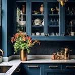
STOP PAINTING YOUR KITCHENS BLUE and white!! (Without doing this one thing*.)
Nothing says “get out of my kitchen asap” like certain, overly saturated shades of blue.
I’ve tried to warn y’all from the beginning but have failed in the field nearly every time – that’s how strong the hooks of this trend have been.
There’s a reason the “blue plate special” at lunch counters existed back in the day. Can anyone guess what that reason was?

Correct. It was to turn over as many customers as possible as quickly as possible when serving adequate and affordable food.
And why, specifically, a blue plate?
Yes, you’re right again! Even then those “in the know” understood that blue, psychologically/physiologically speaking, is the least appetizing color on the spectrum. It doesn’t generally exist in nature as a food so our mouth doesn’t water, and our senses don’t come alive when we see it (no shade to the proud, purplish blueberry).

So why would you bathe the heart of your home where you want folks to gather and feel welcome, and excited to eat your vittles in this unappetizing color?
The short answer is: You don’t!
This one little detail* can save you from an austere, overly formal, or unsavory blue kitchen. Pick a shade of blue with some yellow in it or one that leans towards a shade of green. And bring other warm, more palate-friendly colors into the palette besides white. See below for inspiration.
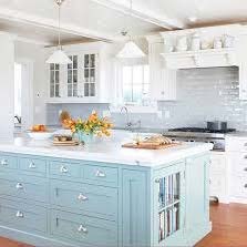


Kitchen design/image credit above left: Steve & Filip Design


Comments